
Visualisation platforms for student data
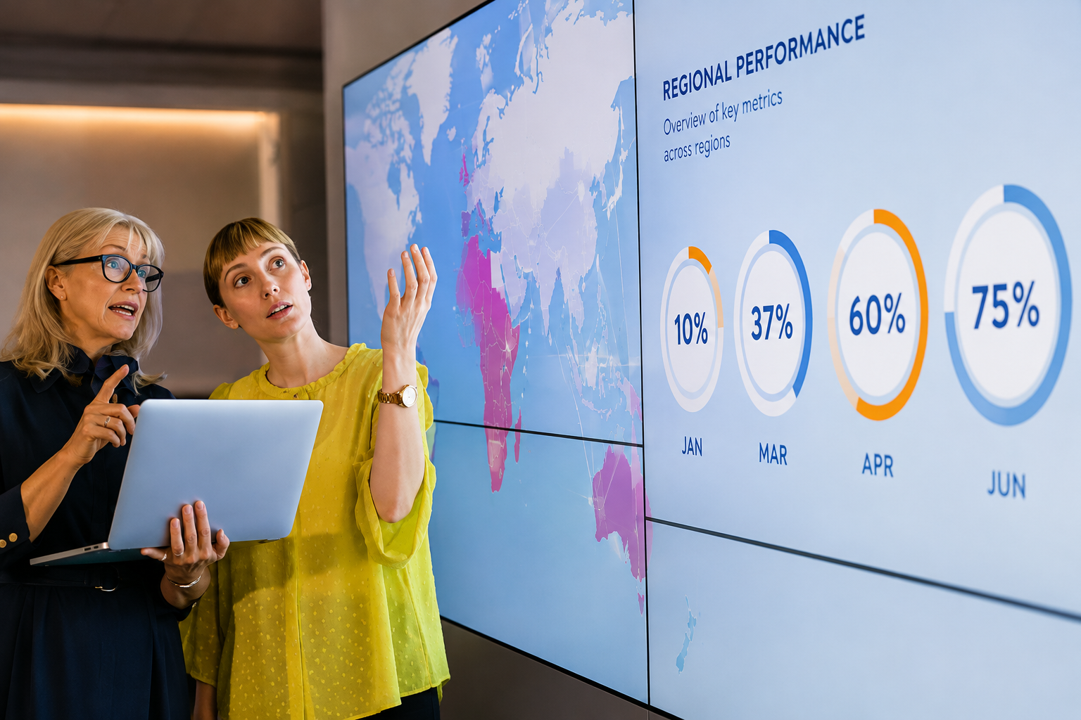
In Australian schools, platforms that visualise student data are sort of becoming a big thing. You know, gone are the days where teachers just typed everything into a learning management system at reporting time. Now there are higher expectations on teachers to use and respond to student data (Australian Institute for Teaching and School Leadership, 2011; Education Council, 2019) so teachers are looking for ways to see what’s going on quickly and honestly, with less hassle. A question I get a lot from school leaders is “which visualisation platform is best for student data”. There are plenty of options out there and yes, most of them do similar tasks, but each one comes with pros and cons that matter in different ways.
When people ask me what’s best, my answer is usually two parts. First, I don’t think there’s one single product that works best for every school and every context, because the needs are never identical. Second, the platform is really the least of your worries it’s what you do with the data that counts. Even though I’m pretty firm about it not really being only about which tech you pick, there are still key things you should weigh up when you’re thinking about a solution for visualising student data in your school. In the end, you need something that is easy to use for teachers so the data and the visuals actually get used and they have an impact on student learning and progress.
Key Elements of Effective Data Use in Schools
Prior to considering the features you should look for in your chosen technology, it is important to first consider the three key elements that contribute to effective data in schools: data literacy, data visualisation and data storytelling (Fisk, 2020).
Data Literacy
Data literacy is the first, fundamental step where we sort of learn how to make sense of the data, what the values mean, and what the data does and does not say us. Without this critical grasp, it is unlikely that data will be used well by teachers and leaders, and it is also very unlikely that their practice will be evidence-informed. We do, after all need to know what the numbers mean, so we can use them properly.
Data Visualisation
Once we have built up our data literacy we can start to develop and/or use data visualisations to help spot trends, bright spots, and areas of growth in the data. This is where data visualisation dashboards and learning management systems come in, as they take the figures and scores and turn them into color-coded cells, graphs, and other kinds of visualisations. That makes it easier to see patterns in the data. Also technology basically makes visualisations more reachable and trends more instantly identifiable.
Visualisations could help show the students who are consistently doing it tough in our learning area, those who struggle with their writing, or show the spread of results across our class. Because we don’t have to rummage through the numbers just to figure out these trends, technology and visualisations make things simpler for us and make those patterns clearer.
Data Storytelling
The most important step, though, in the effective use of data in schools is data storytelling. Good data literacy and even beautiful visuals mean little if teachers aren’t actively looking for “stories” in the data, and then reflecting on what their students need them to know about their strengths and weaknesses. That reflection then helps teachers plan clear, evidence-informed actions based on the data.
This part needs measured and careful System 2 thinking (see Kahneman, 2011), and it ensures our students benefit
What Great Data Visualisation Platforms Should Do
For teachers to really understand the stories inside the data, and then tweak their programs or classroom practice based on what they notice from the data, we really do need solid technological solutions to support that kind of work. In my own experience, I’ve noticed the best data visualisation platforms tend to do a few things , not just one. They usually:
Present the data in a user-friendly way, kind of gathering the information you’re after in a visualisation that makes the analysis easier. Then there’s the whole color-coding part, so trends stand out more clearly, because the colors make patterns feel more visible. They also draw on three or more data points on the one page, so you get a fuller idea of the student, and teachers don’t end up relying on only one little piece of evidence in isolation. Another important bit is that you can select what data is included and what is excluded from the view so the teacher can narrow things down without getting distracted.
Also, good platforms provide access for students and parents to engage with the data platform and look at student results over time, so that includes both formative and summative results, not just one side of the picture. Finally, they bring together the most important data sources on a single landing page, which gives a summary view of the student like the academic overview, key student wellbeing information, a quick summary of standardised testing results, and attendance, too.
Limitations of Current Technology Solutions
Unfortunately, even with all the big tech improvements, there still doesn’t seem to be one single ‘best’ visualisation platform that genuinely fits every school and every context and somehow does all of those things at once. It really doesn’t matter which platform you pick if you keep asking more and more from it because you’ll eventually hit a kind of roadblock where it just can't do what you need anymore.
And yeah, I get it schools have the best intentions they want something that suits their own situation and developers too are convinced they’re offering ‘the best product on the market’ Still, in my day today work with analysing data in schools I keep hearing a bunch of criticisms. Things like :
Developers not being prepared to make adjustments or build new views for a school unless multiple schools request it (and thus the time investment becomes ‘worth it’);
A lack of automation and prompting for teachers (meaning that teachers must seek out data rather than being automatically updated when new/concerning information is added).
Limited or no ability for students to view a full range of results over time (for example, they may only be able to see semester results or only summative assessment results).
Lack of training to support educators to use the data and the platform, to find out what it means and what changes could be made to their practice.
Making Better Decisions About Data Platforms
It is important that schools and leadership teams understand that there are limitations to all technology, but really the most important role you can play in the decision-making process is to hear from as many stakeholders as possible , so you build a clearer understanding of what is needed in your context.
If you know what your school needs before you step into the conversation with tech companies, you are far more likely to end up with a product that actually fits your context , not just the marketing line.
You also need to do your research. Companies will try to sell you their ‘new’ ‘best’ most platform and they will usually hand you a list of schools that have adopted their technology. Once you are narrowing it down to only a few options, reach out to those schools and ask about their experience like what worked well and what surprised them. And please don’t be shy about asking about the problems they have had with the platform or the things it just cannot do. All of that will help you make the right decision for your situation.
FAQ
1. What is student data visualisation?
Student data visualisation is the use of digital tools to convert student performance data into graphs, charts, and dashboards. It helps teachers quickly identify trends, strengths, and learning gaps to support better decision-making.
2. Why is data literacy important for teachers?
Data literacy helps teachers understand what student data means, what it shows, and what it doesn’t. Without it data cannot be used effectively to improve teaching practice or student outcomes.
3. How does data visualisation help in schools?
It turns complex numbers into clear visuals like graphs and colour-coded charts. This makes it easier for teachers to spot patterns, track progress, and identify students who need extra support.
4. What is data storytelling in education?
Data storytelling is interpreting data to understand student needs and plan teaching responses. It goes beyond visuals by helping teachers make meaningful, evidence-based decisions to improve learning outcomes.
5. Is there a best platform for student data visualisation?
There is no single best platform for all schools. The effectiveness depends on school needs, usability, and how well teachers use the data rather than the technology itself.
Conclusion
Ultimately, teachers are busy, and technology should help and kind of streamline the whole process of turning data into actionable insights and shifts in pedagogy; however it’s not always clear which technology solutions are actually best for visualising student data. Schools and school leaders can make better decisions about the right technology for their school, but only if they have a solid grasp of what they really need what the limitations of the tech are, and if they’ve got their own independent research to lean on too.
Good technology and these visualisation platforms should make trends easier to spot. It should allow teachers to choose more evidence-informed decisions in the classroom to support learning and progress for every student even when things get complicated.
